As we wrap up another week, I'm pumped to roll out some fresh image processing smarts in our latest feature drop. If you're building products, managing teams, or coding up a storm like me, these tweaks are designed to save you headaches and deliver pixel-perfect results every time.
Diving Into the Update
This one's all about leveling up how we handle scraped images under the hood. No more raw, inconsistent grabs—everything now goes through a pipeline of normalization, basic classification, and resizing. Here's the breakdown:
- Normalization: We clean up the images automatically, handling conversions from various formats to ensure consistency. Think fixing orientations, stripping unnecessary metadata, and prepping them for seamless integration.
- Classification: We've introduced initial tagging for key types: logo marks (those iconic symbols without text), full logos (with branding), and variants for dark or light modes. This helps you pick the right asset based on your app's theme without manual guesswork.
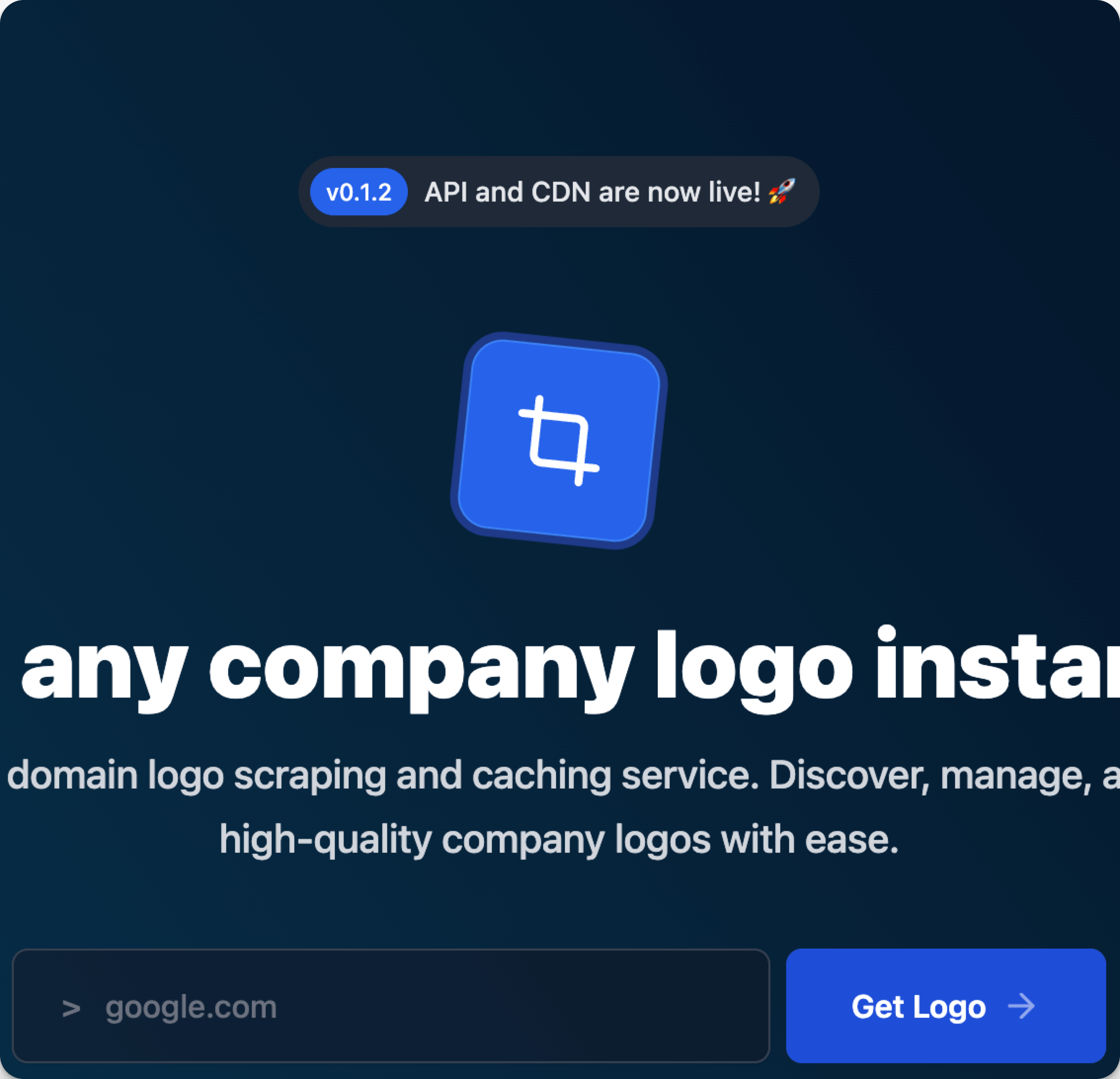
- Resizing: Assets are scaled to standard sizes behind the scenes. By default, our API now returns the primary result as a crisp PNG at 180x180 pixels—ideal for thumbnails, icons, or quick embeds. Want something different? Just tack on query parameters like
?format=svg&size=512x512to customize formats (PNG, SVG, etc.) and dimensions on the fly.
This represents a solid evolution for our API. It's a bigger shift, so I'll be iterating on endpoint handling in the days ahead to keep things intuitive and backward-compatible where possible.
Why This Rocks for Your Workflow
As an entrepreneur wearing all hats, I get it—time is money. For developers, this means plug-and-play assets that fit your designs without extra post-processing code. Product managers can rely on uniform outputs for reports or UIs, ensuring brand consistency across dark/light modes. And fellow bootstrappers? It's one less thing to build yourself, freeing you up to focus on growth.
I've tested this on a bunch of domains, and the difference is night and day—pun intended. Dark-mode logos now get prioritized correctly in classifications, making your apps look pro without the fuss. The new update will be released in the coming days, so stay tuned.
How to Use It
If you're already hitting our API (e.g., https://api.brandql.com/logo/brandql.com), nothing changes for you. These enhancements will be live in the next few days. Add those query params for tweaks, or stick with defaults for simplicity. Peek at the updated docs for full examples and best practices.
What's Coming Next
We're not stopping here. The roadmap includes deeper classification refinements—especially nailing down dark vs. light variants more accurately. Plus, tweaks to default primary logos, like handling transparent vs. colored backgrounds out of the box (no params needed). Stay tuned; these will make adaptive branding even easier. Extracting color palettes from logos is another thing worth exploring.
Your feedback keeps this engine running—share thoughts below or ping me on X (@useBrandQL). Let's make BrandQL unstoppable together.
Best,
Christian